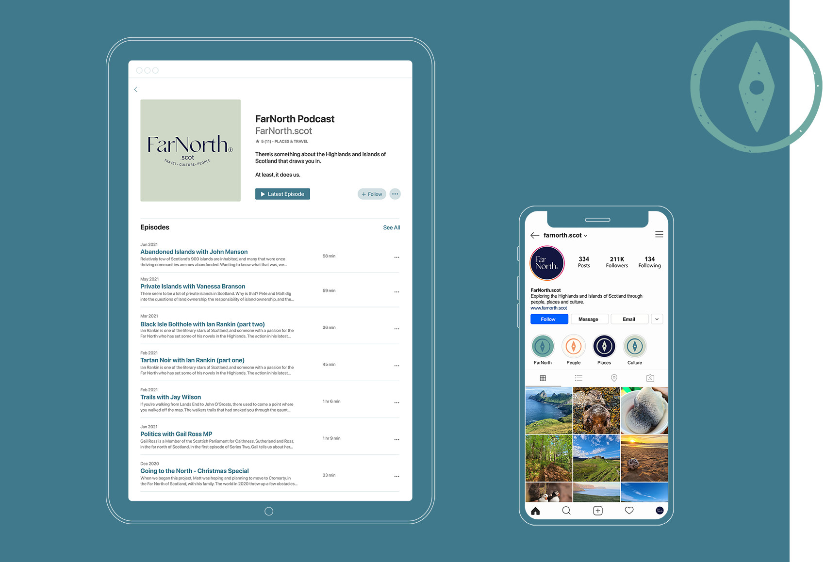
I was approached by FarNorth to rebrand their visual identity and create a contemporary brand which reflects their multi-faceted work in the fields of podcasting, journalism and social media. As their work focuses around celebrating the people and landscapes of the Far North of Scotland, it was imperative that the new brand reflect the area without falling victim to the many clichés often seen in visual representations of this part of the world.
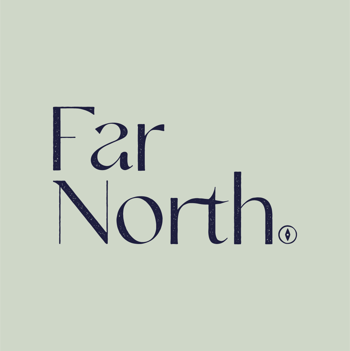
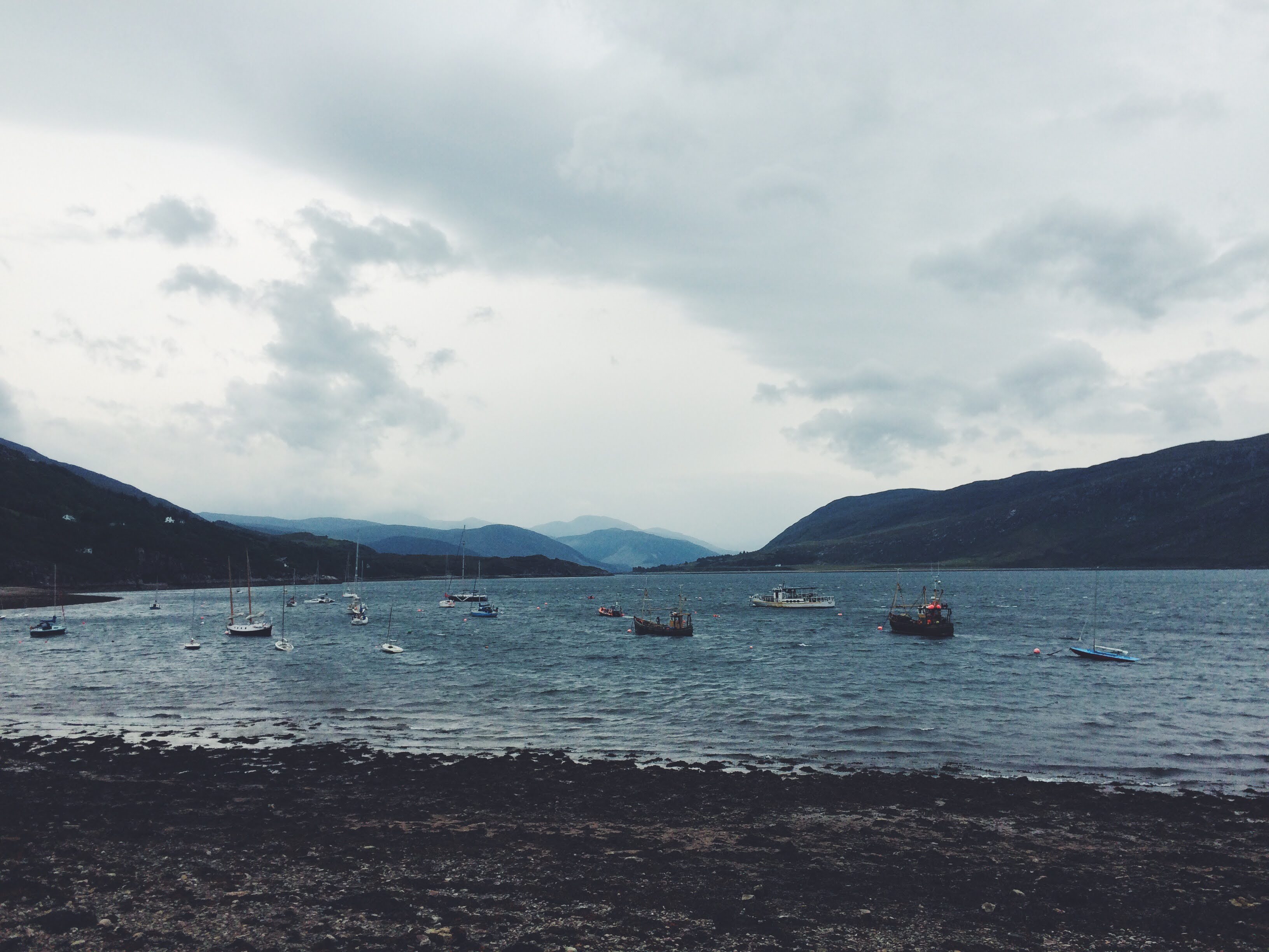
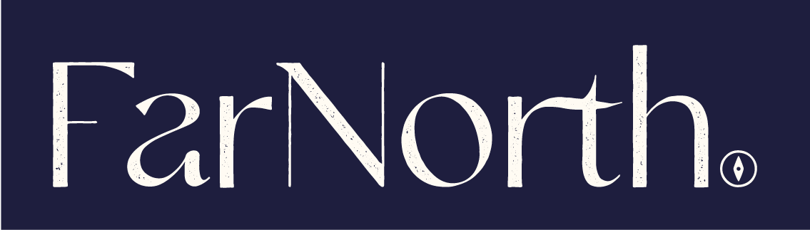
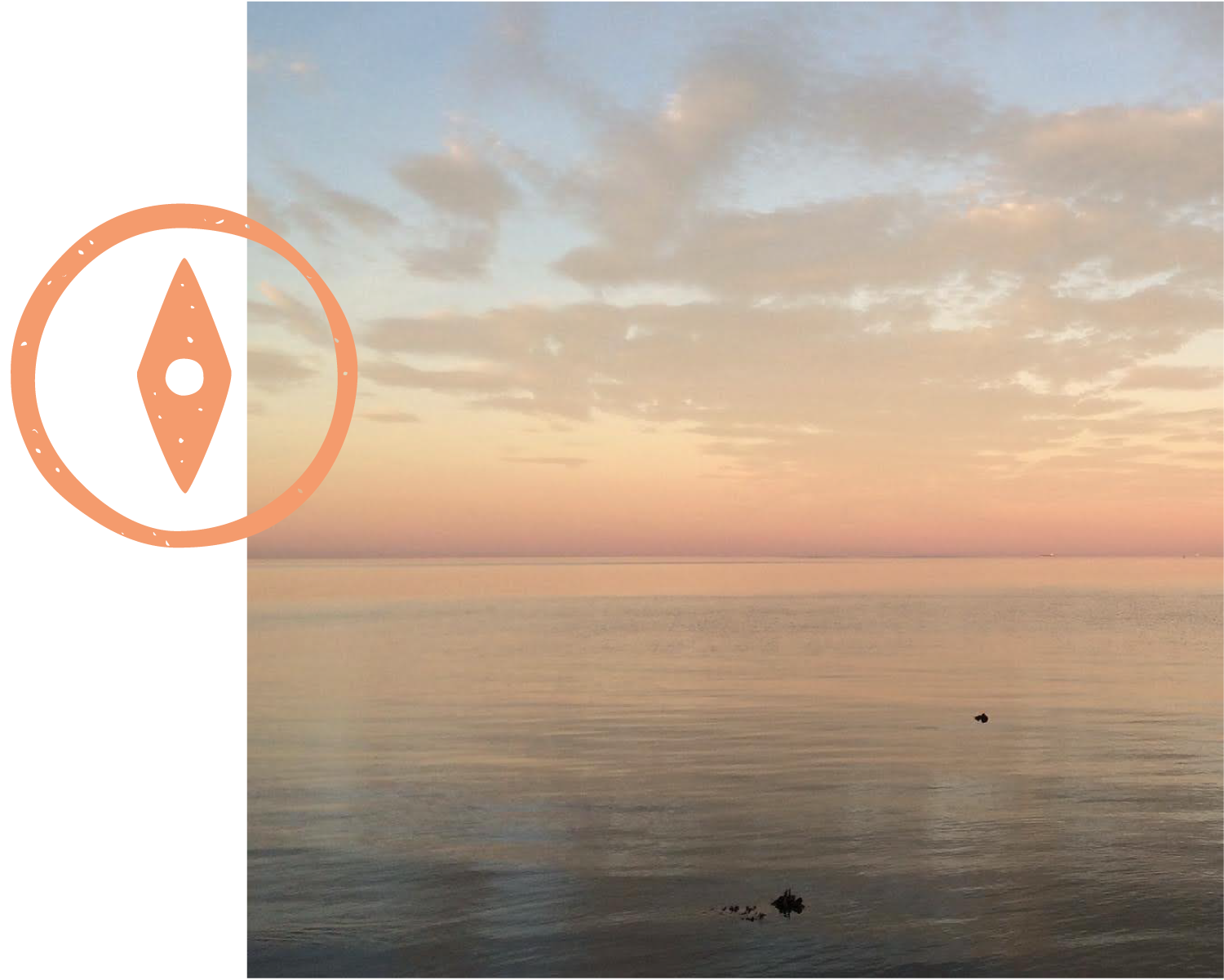
The Highlands are often portrayed as some sort of inhospitable wilderness, but this is not their true nature. On the contrary, the land and waterways of the Northern Highlands are among the most fertile and beguiling in the world; their beauty lies in the huge variety of climates, landforms and creatures which call them home. This is what this identity embodies; the way rolling moors can suddenly give way to an abrupt cliff face or a burn winding its way down a mountain ravine. The motif of a compass is used as a form of punctuation, bringing a literal sense of “northern-ness” without overwhelming the balance of the typography.
This identity conveys the character of the Highlands in a sleek and succinct way, while avoiding the many platitudes often attached to our part of the world. The new brand uses a palette of four complementary colours to offer lots of versatility, allowing it to seamlessly adapt to different situations.